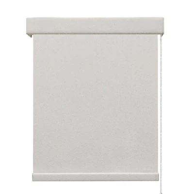
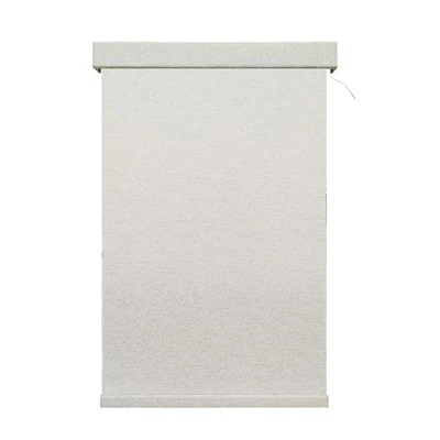
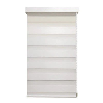
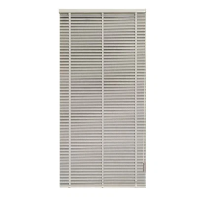
Hey there! As a supplier of Cordless Softness Blind, I've seen firsthand how the right color of blinds can transform a space. Picking the perfect color for your cordless softness blinds isn't just about aesthetics; it's about creating a harmonious and functional environment. So, let's dive into how you can choose the ideal color for your decor.
Consider the Room's Function
First things first, think about what the room is used for. Different rooms have different vibes and requirements.
-
Living Room: This is where you entertain guests and relax. You'll want a color that's inviting and versatile. Neutral colors like beige, gray, or light brown are great choices. They create a calm and sophisticated atmosphere and can easily match different furniture styles. For example, a light gray cordless softness blind can complement both modern and traditional living room setups.


-
Bedroom: Your bedroom is your sanctuary. You might want to go for colors that promote relaxation and privacy. Soft blues, greens, or muted pastels can work wonders. These colors can help you unwind after a long day and create a cozy sleep environment. A pale blue blind can give your bedroom a serene and peaceful feel.
-
Kitchen: In the kitchen, you need colors that are easy to clean and can withstand moisture and grease. Light colors like white or cream are practical as they don't show dirt as easily. They also make the kitchen look bright and airy. Plus, they pair well with stainless - steel appliances and colorful kitchenware.
-
Home Office: If you're working from home, you'll want a color that boosts productivity and focus. Earthy tones like olive green or warm yellows can be energizing. They add a touch of nature and positivity to your workspace, making it a more pleasant place to be.
Match with Existing Decor
Another crucial factor is how the blind color will fit in with your existing decor.
- Furniture: Take a look at your furniture pieces. If you have dark - colored furniture, lighter - colored blinds can provide a nice contrast. For instance, if you have a black leather sofa, a white or beige cordless softness blind will make the room look more balanced. On the other hand, if your furniture is light, you can choose blinds in a slightly darker shade to add depth.
- Wall Color: The wall color is a major determinant. If your walls are painted in a bold color, you might want to go for a neutral blind color to avoid overwhelming the space. For example, if you have bright red walls, a gray or cream blind will tone down the intensity. If your walls are a neutral color, you have more freedom to experiment with bolder blind colors. You could add a pop of color with a bright orange or purple blind to make a statement.
- Flooring: The flooring also plays a role. Light - colored floors look great with darker blinds, as it creates a visual anchor for the room. Dark floors, on the other hand, can be paired with lighter blinds to make the room feel more open and airy.
Think About Lighting
Lighting can have a significant impact on how the color of your blinds appears.
- Natural Light: If your room gets a lot of natural light, you can choose darker colors without worrying about the room feeling too dark. The sunlight will brighten up the space, and the darker blinds can add a touch of drama. For example, a chocolate - brown blind in a sun - filled living room can look luxurious. If your room has limited natural light, lighter colors are better as they can reflect light and make the room seem more spacious.
- Artificial Light: Consider the type of artificial light in your room. Warm - toned bulbs can make colors look more vibrant and cozy, while cool - toned bulbs can give colors a different hue. If you use a lot of warm - toned lighting, colors like reds, oranges, and yellows will look even more inviting.
Play with Color Psychology
Color psychology is real, and it can influence your mood and the overall atmosphere of a room.
- Red: Red is a powerful color that evokes energy and passion. It can be a great choice for a room where you want to create a lively and exciting atmosphere, like a game room or a home theater. However, too much red can be overwhelming, so you might want to use it sparingly, perhaps as an accent color on the blinds.
- Blue: As mentioned earlier, blue is associated with calmness and relaxation. It's a safe bet for bedrooms and living rooms. Different shades of blue can have different effects. Darker blues can be more dramatic, while lighter blues are more soothing.
- Yellow: Yellow is a color of happiness and optimism. It can add a sunny and cheerful vibe to any room. A yellow cordless softness blind can brighten up a dull corner or make a small room feel more spacious.
- Green: Green represents nature and growth. It can bring a sense of tranquility and balance to your space. Whether it's a deep forest green or a light mint green, it can make your room feel fresh and alive.
Other Cordless Softness Blind Options
We also offer other types of softness blinds that might interest you. Our Pull - Chain Motorized Softness Blind provides the convenience of motorized operation with the option of a pull - chain for manual control. It comes in a variety of colors, so you can still find the perfect match for your decor.
The Chain Softness Blind is another great choice. It offers a classic look and is available in different color palettes. You can choose a color that suits your style and functional needs.
Conclusion
Choosing the right color of cordless softness blinds for your decor is a combination of considering the room's function, matching with existing decor, thinking about lighting, and understanding color psychology. With so many options available, you're sure to find the perfect color that will enhance your space and meet your needs.
If you're interested in purchasing our cordless softness blinds or want to learn more about our color options, feel free to reach out. We're here to help you make the best choice for your home or office. Let's work together to create a beautiful and functional space!
References
- Color Psychology in Interior Design: A Guide to Creating the Right Mood, Interior Design Journal, 2022.
- The Impact of Lighting on Color Perception in Home Decor, Home Decor Magazine, 2023.